
SPLIT TONING techniques in Photoshop
- Jürgen Niit
- Apr 13, 2020
- 7 min read

Updated: Apr 18, 2020
HISTORY
Split toning is an old film developing effect where the images come out somewhere between black & white. Film photographers developed sepia toning and found out their image to have not completely bleached and this left a multi-toned style image which was given the name split toning (or brownscaleing). This simple process in the darkroom bleaches the photographic paper to "remove" the silver in the emulsion and then replaces it with a toned silver compound. Also, it gives longevity to the photos on paper.
When we did this chemical process in our school darkroom, we had to give a signature that we know the risks and if anything happens, school is not responsible. Because sepia emulsion is extremely poisonous.
EXAMPLE IMAGE
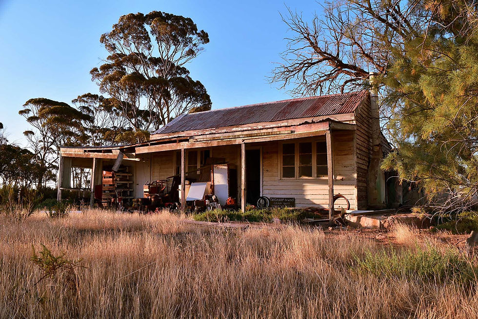
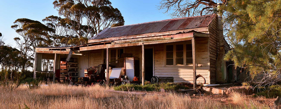
I'm going to use the following photo as an example of what is possible to do with split toning and how many different approaches you can take in Photoshop. And these are just a few ones out of many.

I took this image a few years ago while traveling on Australia's rural areas. I have just little color-corrected it and haven't done anything major to it.
SPLIT TONING TODAY
Split Toning is the desired effect amongst digital photographers (and videographers) and can be created using almost any digital editing software. Usually, it is made up of two tones which affect Highlight, Shadow and everything between that. It is a really useful tool when you have some kind of knowledge about color theory.

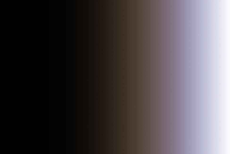
Down here is an example, that we got everything showed here from blacks, shadows, midtones (Photoshop & Lightroom calls it Exposure), Highlights and whites.
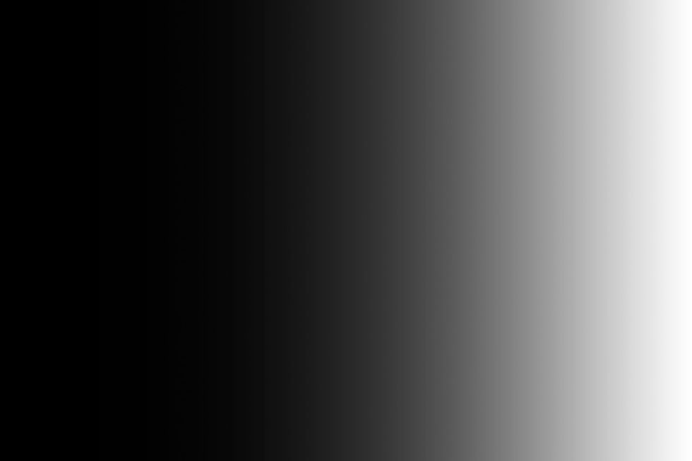
When we apply probably the most used split toning combo "Teal & Orange" we can see that whites and blacks are not influenced by it. And Shadow area applied orange are taking over mid-tones. You can see, that if the Saturation slider is in maximum, it still does not affect black and whites, because they are not colors.
TEAL & ORANGE
I'm applying the "Teal & Orange" Split Toning effect on the same image different way and you can see what difference it CAN make. There are few good reasons why I use in this example "Teal & Orange".
they are complementary colors
it has highest contrast between their exposure values of any pair of complementary colors on the color wheel
adds depth
most of the skin tones are in the orange area, so in photos or videos it makes them "pop"
warmer tones are more inviting
It is probably the most used color scheme in movies throughout all of the time.
All the methods I describe here are made by using non-destructive editing. It means changes are made with layers and not adjusting the main image. If you don't have tabs what I´m talking about in here, you should click Window up on the menubar and all the tabs you need for editing are there.
METHOD 1: CAMERA RAW
Camera RAW is a great tool to do adjustments to images. It is basically a Lightroom in Photoshop - the same editing capability. And for Split Toning there is a dedicated tab for it. I usually use it after I have done retouching and just need a little tweaking in colors or on event photos. Event photos don't need retouching (usually) and I only need to play around with exposure, contrast, cropping and tweaking colors a bit.
make a copy of your image in Photoshop
right-click on the copied layer and select Convert to Smart Object
now select Filter on up menu bar and from there Camera RAW Filter...
Split Toning tab and select your desired tones
It is an easy way to do it but does not give much of the control.

METHOD 2: SOLID COLOR
I used to use Solid Color method when I started out at Photoshop. It´s a pretty rough method but works fine for Instagram or other similar platforms. I would not recommend this for big prints or commercial work. Still nice and easy to use.
Create Solid Color layer from Layers tab in the right bottom corner and Color Picker window pops up

Set Hue value (red circle) 237 and drag small dot (yellow circle) all the way to top right corner and you get nice blue color

from Blend Modes dropdown menu choose Color Dodge to affect the Highlights

take Fill slider somewhere 3-12%
create new Solid Color layer
Set Hue value 33 and drag small dot all the way to top right corner and you get nice orange color
form Blend Modes to choose Color Burn to affect Shadow areas
take Fill slider somewhere 3-12%
you can create Curves layer on top those layers to control contrast

METHOD 3: GRADIENT MAP
It almost gives similar results but a bit more saturated outcome. I like to use this method on automotive photography and it gives a nice touch to sunrise and sunset photos.
create a Gradient Map layer form Adjustment tab
(if you don't have Adjustment tab go click Window up on menubar and select Adjustments)
go to the Properties tab and you can see a little gradient bar (red circle) and click on that
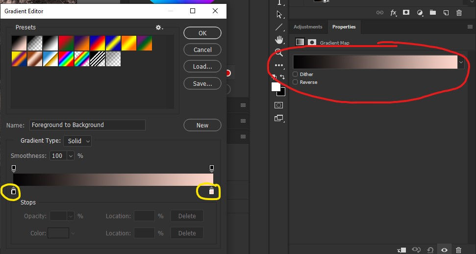
it opens up a Gradient Editor tab and doing double-click on the nodes (yellow circle) you can choose the gradient colors
by clicking on left node you can influence Shadows of the photo
put the Hue (bigger red circle) value 33 and drag small dot (small red circle) all the way to the top right corner and press OK

now double-click on the right node to bring up Gradient Editor for Highlights
put the value on Hue 237 and slide little dot up to the right top corner and press OK
press OK on Gradient Editor and you gonna get a pretty awkward looking image
now on Layers tab, there is a drop-down menu for Blending Mode which say Normal, click on that choose Overlay blending option
next to Blending Mode drop-down menu are two sliders Opacity and Fill
I suggest using Fill slider and bring it to 10% range see how esthetically pleasing does it look to your eyed
METHOD 4: HUE LAYERS
This tool creates more contrast to images and works well on landscape photos. Really pushes colors on Shadow and Highlight areas. I use part of it in fashion photos, it gives a more dramatic feel to the dark areas.
from the Adjustments tab create Hue/Saturation tab and choose Blend Mode from Layers tab Color Burn.
choose your desired color from Hue slider for Shadow areas ( I chose -11) and play with Saturation slider (I chose +30)
Color Burn applies Shadow areas of photos. It has the same effect as using the Burn tool but it applies on all image Shadow areas
use Fill slider and keep it around 3-10% if some areas feel too dark use Opacity slider to give little fix
create new Hue/Saturation layer from the Adjustments tab and choose Blend Mode Color Dodge (yup, just like Dodge tool)
choose your desired color from Hue slider for Highlight areas ( I chose -160) and play with Saturation slider (I chose +30)
use Fill slider and keep it around 3-10% if some areas feel too highlighted or overexposed use Opacity slider to give a little fix

METHOD 5: DUO TONE
Duo toning is a bit more advanced technique. I like the results with the "Orange & Teal" color scheme, it gives a bit rustic and same time Magenta look. I use it on minimalistic style photos or photos, there are only a few tones strongly represented. With colorful and bubbly photos it doesn't really give an effect.
make a copy of your image in Photoshop Layers tab (CTRL/CMND+J)
right-click on the copied layer and select Convert to Smart Object
double-click in Layer tab on the image so it would open in new Photoshop tab
in that new tab click Image -> Mode -> Grayscale
now click Image -> Mode -> Duotone
If Duotone isn't available for some reason, try to switch Image Mode between 8 and 16-bit. (Image -> Mode -> 8-Bits/Channel or 16-Bits/Channel)
now you have Duotone Options pop up
click on Ink 1: (red circle) and insert Hue value 33 (bigger yellow circle) and drag small dot all the way to top right corner (smaller yellow circle) . Press OK

now click on Ink 2: color pad and insert Hue value 237 and drag small dot all the way to top right corner. Press OK.
press OK in Duotone Option and choose File -> Save and close this image in Photoshop tab
now set image Blend Mode to Multiply to change Highlights of image and drag Fill slider somewhere to 10-22% area.
copy the same layer and right-click on the layer to choose Clear Layer Style
now choose Blending Mode to Screen to affect Shadow areas of the image and bring it down somewhere 3-15%
copy the same layer again and right-click on the layer to choose Clear Layer Style
to add some contrast to it (and it is totally optional) change Blend Mode to Soft Light to give more contrast. A suggested percentage is somewhere between 5-15%
and to get even more control, create a Curves layer on top of those layers, so you can have more precise color control in Shadows and Highlights

CONCLUSION
There are many color schemes to use those methods and I invite you to test and play around. You can get some amazing results out of this. Find your own way or favorite color scheme to build your Insta feed or portfolio. These methods are good to develop your own style and editing "handwriting".
The best thing is that you don't have to stick just for two colors. With Hue Layers and Gradient Map, you can add more colors to the mix. But a usually good rule of thumb is "Less is more" and too much can be distracting.
Now you see that I often suggest using Fill slider with Blending Modes, not the Opacity one. While you doing simple photo editing it pretty much has no effect. Once you start applying effects on in, you can see a clear difference. Opacity affects the whole layer whereas Fill does not affect any layer style.
I'm gonna leave all photos down here with different Split Toning methods, so you can see side by side comparison. There are small delicate differences that can matter much to your current or future client.


Comments